[React-native CLI] RN에서 그래프 라이브러리 추천 (react-native-gifted-charts 사용방법)
이번 프로젝트에서 꼭 필요한 요소 중 하나인 차트
리액트에서 유명한 차트 라이브러리가 많이 때문에 고민을 했었는데
리액트 네이티브에서는 너무 없어서 설치해 보고 내가 원하는 디자인으로 커스텀이 가능한지 확인하고 테스트하면서
설치 삭제를 3번정도 진행한 뒤 드디어 100% 만족은 아니지만 어느 정도 만족하는 차트라이브러리를 찾게 되었습니다.
제가 선택한 라이브러리는 react-native-gifted-charts라는 라이브러리입니다.
그동안 무슨 라이브러리를 설치하고 왜 사용안했는지에 대한 설명과 react-native-gifted-charts 사용방법에 대해 설명하겠습니다.
react-native-chart-kit
RN에서 그래프 라이브러리 중 가장 유명하기도 하고, 주간 다운로드가 50,000이 넘어서 설치해 보았습니다.
단순한 막대그래프형태의 그래프를 원했는데 디자인이 너무 난잡하고,
무엇보다 커스텀을 도저히 할 수가 없어서 포기했습니다.
bar의 투명도를 없애고 너비를 조절하고 싶은데 그런 기능 없더라고요;;; 그래서 포기
react-native-gifted-charts
그다음으로 유명한 라이브러리입니다. 주간다운로드수가 거의 5만이라 믿고 설치했는데,
이 라이브러리는 react-native-svg 버전과 충돌이 발생하는 문제 있었습니다.
버전을 6, 7로 다운업그레이드를 하라는데 그렇게 하면 SvgXml을 사용할 수가 없습니다... 그래서 포기
import {SvgXml} from 'react-native-svg';이걸 사용 못해요ㅠㅠ
react-native-gifted-charts
마지막으로 정착한 차트 라이브러리입니다.
https://hyunki99.tistory.com/80#--%--react-native-gifted-charts
이 블로그에서 추천한 차트 라이브러리라서 설치해 보았습니다.
https://www.npmjs.com/package/react-native-gifted-charts?activeTab=readme
react-native-gifted-charts
The most complete library for Bar, Line, Area, Pie, Donut, Stacked Bar and Population Pyramid charts in React Native. Allows 2D, 3D, gradient, animations and live data updates.. Latest version: 1.4.7, last published: 2 months ago. Start using react-native-
www.npmjs.com
주간 다운로드 수가 11,456이정도라서 설치할까 말까 고민되긴 했지만
애초에 리엑트네이티브에 차트라이브러리가 별로 없으니 어쩔 수 없는 것 같습니다.
사용방법은 아래링크를 참고하시면 됩니다.
https://gifted-charts.web.app/barchart
Gifted Charts
gifted-charts.web.app
이 라이브러리가 인기 있는 라이브러리가 아니다 보니 chatGPT에 사용방법을 쳐도 잘 안 나와서 차트 커스텀하기 힘들었습니다.
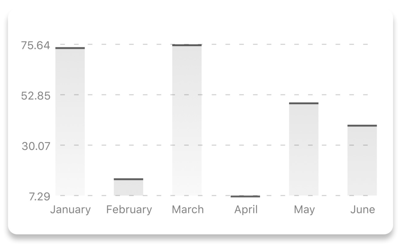
구현 화면
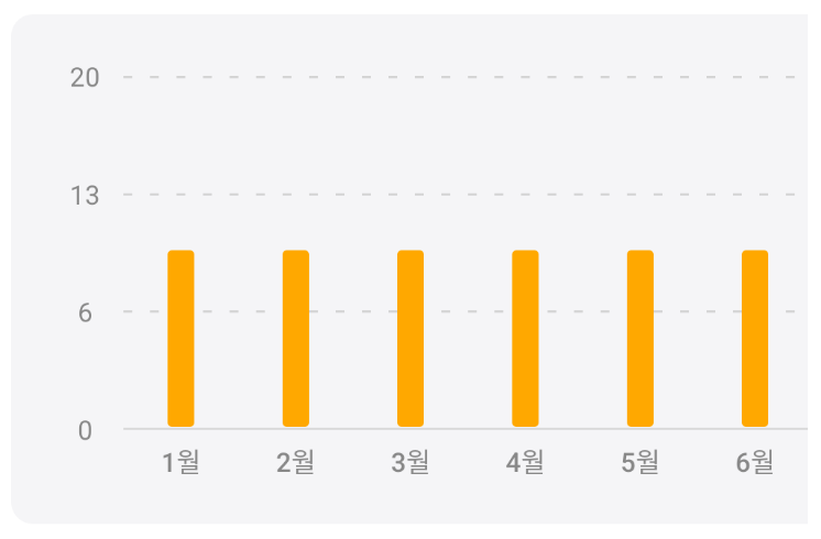
최대한 깔끔한 디자인을 원해서 이렇게 커스텀해보았습니다.
구현 코드
const BarChartView = () => {
  const labelTextStyle = {
    fontSize: 12,
    fontWeight: 500,
    color: '#888',
  };

  const yAxisTextStyle = {
    fontSize: 12,
    color: '#888',
  };

  const data = [
    {value: 10, label: '1월', labelTextStyle: labelTextStyle},
    {value: 10, label: '2월', labelTextStyle: labelTextStyle},
    {value: 10, label: '3월', labelTextStyle: labelTextStyle},
    {value: 10, label: '4월', labelTextStyle: labelTextStyle},
    {value: 10, label: '5월', labelTextStyle: labelTextStyle},
    {value: 10, label: '6월', labelTextStyle: labelTextStyle},
    {value: 10, label: '7월', labelTextStyle: labelTextStyle},
    {value: 10, label: '8월', labelTextStyle: labelTextStyle},
    {value: 10, label: '9월', labelTextStyle: labelTextStyle},
    {value: 10, label: '10월', labelTextStyle: labelTextStyle},
    {value: 10, label: '11월', labelTextStyle: labelTextStyle},
    {value: 10, label: '12월', labelTextStyle: labelTextStyle},
  ];

  return (
    <Style.scrollView
      horizontal={true}
      showsHorizontalScrollIndicator={false} // 수평 스크롤바 숨기기
    >
      <Style.container>
        {/* Bar Chart */}
        <BarChart
          // 기본
          data={data}
          width={612}
          height={160}
          disablePress // 누루기 동작 비활성화
          // bar
          initialSpacing={20} // 초기 간격
          spacing={40} // bar 간격
          barBorderRadius={2}
          barWidth={12} // bar width
          frontColor={'#FFA800'} // bar 색상
          // x축
          xAxisIndicesColor={'#D9D9D9'} // x축 단계별 표시 색상
          xAxisColor={'#d9d9d9'} // x축 색상
          // y축
          yAxisTextStyle={yAxisTextStyle}
          yAxisThickness={0} // 메인 y축
          noOfSections={3} // 가로 회색줄 갯수
        />
      </Style.container>
    </Style.scrollView>
  );
};
3월 26일에 다시 수정한 코드
// react, react-native
import React from 'react';
import {BarChart} from 'react-native-gifted-charts';

// style
import Theme from '../../styles/Theme';
import {BarChartView as Style} from '../../styles/chart.styles';

interface PropsType {
  // recordData: {value: number; label: string}[];
  recordData: any;
}
const BarChartView = ({recordData}: PropsType) => {
  const labelTextStyle = {
    fontSize: 12,
    fontWeight: 500,
    color: `${Theme.colors.darkGrey}`,
  };

  const yAxisTextStyle = {
    fontSize: 12,
    color: `${Theme.colors.darkGrey}`,
  };

  const data = [
    {value: 10, label: '1월'},
    {value: 10, label: '2월'},
    {value: 10, label: '3월'},
  ];

  console.log('왜 안나오지?', recordData);

  return (
    <Style.wrap>
      <Style.container>
        {/* Bar Chart */}
        <BarChart
          // 기본
          data={recordData}
          height={160}
          disablePress // 누루기 동작 비활성화
          // bar
          initialSpacing={20} // 초기 간격
          spacing={40} // bar 간격
          barBorderRadius={2}
          barWidth={12} // bar width
          frontColor={Theme.colors.main} // bar 색상
          // x축
          xAxisLabelTextStyle={labelTextStyle}
          xAxisIndicesColor={Theme.colors.grey} // x축 단계별 표시 색상
          xAxisColor={Theme.colors.grey} // x축 색상
          // y축
          yAxisTextStyle={yAxisTextStyle}
          yAxisThickness={0} // 메인 y축
          noOfSections={3} // 가로 회색줄 갯수
        />
      </Style.container>
    </Style.wrap>
  );
};

export default BarChartView;