
[React-native CLI] RN 차트스크린 구현하기 (월간, 연간)
이번에는 차트페이지를 만들어보려 합니다.
구현할 화면

그래프를 막 그리긴 했지만 대강 이런 디자인으로 구현하고자 합니다.
이 스크린의 기능에 대해 간단하게 설명하자면 작성한 운행일지 기록 데이터의 월간, 연간에 대한 영업금액 차트 화면입니다.
구현 기능
항목을 크게 나누면 탭, 차트, 리스트로 구분되어 있습니다.
탭 : 월간, 연간
월간
- 년도를 표시하는 달력타이틀이 있음
- 차트에는 해당 연도에 대한 1월 ~ 12월까지의 영업금액 데이터가 나옴
- 리스트에는 해당 연도에 대한 1월 ~12월까지에 대한 영업금액 데이터가 역순으로 나옴(최신 데이터가 제일 위에 있음)
연간
- 년도를 표시하는 달력타이틀이 없음
- 차트에는 연도별 영업금액 데이터가 나옴
- 리스트에는 연도별 영업금액 데이터가 역순으로 나옴(최신 데이터가 제일 위에 있음)
월간, 연간
월간, 연간 둘 다 데이터가 없을 경우 차트, 리스트 컴포넌트에 "데이터가 없습니다". 출력
폴더 구조
주요 폴더
- components/chaart/~
- utils/recordFilterData.ts
구현 코드
screens/Chart.tsx
// react, react-native
import React, {useState} from 'react';

// library
import dayjs from 'dayjs';
import {useRecoilValue} from 'recoil';

// recoil, utils
import {recordState} from '../recoil/atoms';
import {chartMonthData, chartYearData} from '../utils/recordCustomData';

// component
import Tabs from '../components/chart/Tabs';
import CalendarTitle from '../components/chart/CalendarTitle';
import BarChartView from '../components/chart/BarChartView';
import DataList from '../components/chart/DataList';

// style
import {Chart as Style} from '../styles/chart.styles';

const Chart = () => {
  const recordData = useRecoilValue(recordState);
  const currentYear = dayjs().format('YYYY');

  const [selectedTab, setSelectedTab] = useState('month');
  const [selectYear, setSelectYear] = useState(currentYear);

  /*
  *월간*
  선택한 년도의 월간 영업금액 나오기
  [{value: 영업금액, label: '3월'}]
   */
  const monthRecordData = chartMonthData(recordData, selectYear);

  /*
   *연간*
  작성을 시작한 년도부터 연간 영업금액
  [{value: 10, label: 2024년}]
   */
  const yearRecordData = chartYearData(recordData);

  return (
    <>
      <Style.wrap>
        {/* 탭: 월간, 연간 */}
        <Tabs selectedTab={selectedTab} setSelectedTab={setSelectedTab} />

        {/* 월별 달력 */}
        {selectedTab === 'month' ? (
          <CalendarTitle
            currentYear={currentYear}
            selectYear={selectYear}
            setSelectYear={setSelectYear}
          />
        ) : (
          ''
        )}

        {/* 차트 */}
        <BarChartView
          recordData={
            selectedTab === 'month' ? monthRecordData : yearRecordData
          }
        />
      </Style.wrap>

      <Style.line />

      {/* 데이터 리스트 */}
      <DataList
        selectedTab={selectedTab}
        selectYear={selectYear}
        recordData={selectedTab === 'month' ? monthRecordData : yearRecordData}
      />
    </>
  );
};

export default Chart;
탭이 month가 아닐 경우 CalenderTitle은 필요 없기 때문에 탭이 month일 경우에만 CalendarTitle 컴포넌트가 나오게 해 주었습니다.
components/chart/Tabs.tsx
// react, react-native
import React, {Dispatch, SetStateAction} from 'react';

// style
import {Tabs as Style} from '../../styles/chart.styles';

interface PropsType {
  selectedTab: string;
  setSelectedTab: Dispatch<SetStateAction<string>>;
}

const Tabs = ({selectedTab, setSelectedTab}: PropsType) => {
  const handleTabPress = (tab: string) => {
    setSelectedTab(tab);
  };

  return (
    <Style.container>
      <Style.tabButton
        select={selectedTab === 'month'}
        onPress={() => handleTabPress('month')}>
        <Style.tabText select={selectedTab === 'month'}>월간</Style.tabText>
      </Style.tabButton>
      <Style.tabButton
        select={selectedTab === 'year'}
        onPress={() => handleTabPress('year')}>
        <Style.tabText select={selectedTab === 'year'}>연간</Style.tabText>
      </Style.tabButton>
    </Style.container>
  );
};

export default Tabs;
utils/recordFilterData.ts
이 파일은 record데이터를 커스텀할 때 사용하는 폴더입니다.
지금은 chart 스크린에서 사용하는 record 커스텀 데이터 함수만 옮겨두었습니다.
// library
import dayjs from 'dayjs';
import {RecordType} from '../types/types';

// 선택한 년도의 데이터 가져오기
export const selectYearData = (recordData: RecordType[], year: string) => {
  return recordData.filter(data => dayjs(data.date).format('YYYY') === year);
};

// Chart
type ChartDataObjectTypes = {[key: number]: number};

// Chart_월별 데이터 => [{value: 10, label: '1월'}, {}]
export const chartMonthData = (recordData: RecordType[], year: string) => {
  // 월별 영업금액 저장 => {"2": 8, "3": 324248}
  const monthlyOperatingAmount: ChartDataObjectTypes = {};

  selectYearData(recordData, year).forEach(data => {
    const month = dayjs(data.date).month() + 1;

    if (!monthlyOperatingAmount[month]) {
      monthlyOperatingAmount[month] = data.operatingAmount;
    } else {
      monthlyOperatingAmount[month] += data.operatingAmount;
    }
  });

  // monthlyOperatingAmount객체를 BarChart data에 담을 배열로 변환 => {value: 10, label: '1월'}
  return Object.keys(monthlyOperatingAmount).map(month => ({
    value: monthlyOperatingAmount[parseInt(month, 10)],
    label: `${parseInt(month, 10)}월`,
  }));
};

// Chart_년별 데이터 => [{value: 10, label: '1월'}, {}]
export const chartYearData = (recordData: RecordType[]) => {
  // 년별 영업금액 저장 => {"2024": 324256}
  const yearOperatingAmount: ChartDataObjectTypes = {};

  recordData.forEach(data => {
    const yearData = dayjs(data.date).year(); // dayjs로 연도 추출
    if (!yearOperatingAmount[yearData]) {
      yearOperatingAmount[yearData] = data.operatingAmount;
    } else {
      yearOperatingAmount[yearData] += data.operatingAmount;
    }
  });

  // yearOperatingAmount객체를 BarChart data에 담을 배열로 변환 => [{"label": "2024년", "value": 324256}]
  return Object.keys(yearOperatingAmount).map(yearData => ({
    label: `${yearData}년`,
    value: yearOperatingAmount[parseInt(yearData, 10)],
  }));
};
이번 프로젝트에서 react-native-gifted-charts라는 차트라이브러리를 사용했습니다.
이 차트라이브러리에서는 data를 아래와 같은 형식으로 받기 때문에 이 형식에 맞게 커스텀해주었습니다.
const barData = [
    {value: 15, label: '1'},
    {value: 30, label: '2'},
    {value: 26, label: '3'},
    {value: 40, label: '4'}
];
월간, 연간 데이터 둘 다
1차로 forEach를 사용하여 각 월, 년에 맞는 영업금액의 총합을 객체로 만들고,
2차로 map을 사용하여 차트라이브러리에 맞는 형식의 배열로 만들어주었습니다.
components/chart/CalendarTitle.tsx
import React, {Dispatch, SetStateAction} from 'react';
import {View} from 'react-native';
import {SvgXml} from 'react-native-svg';

// library
import dayjs from 'dayjs';

// assets
import {svg} from '../../assets/svg';

// style
import Theme from '../../styles/Theme';
import {CalendarTitle as Style} from '../../styles/common.styles';

interface PropsType {
  currentYear: string; // 현재 달
  selectYear: string;
  setSelectYear: Dispatch<SetStateAction<string>>;
}

const CalendarTitle = ({currentYear, selectYear, setSelectYear}: PropsType) => {
  // 이전 달력으로 이동
  const onPrevPress = () => {
    const nextYear = dayjs(selectYear).subtract(1, 'year').format('YYYY');
    setSelectYear(nextYear);
  };
  // 다음 달력으로 이동
  const onNextPress = () => {
    const nextYear = dayjs(selectYear).add(1, 'year').format('YYYY');
    setSelectYear(nextYear);
  };
  // 현재 달로 이동
  const onCurrentPress = () => {
    setSelectYear(currentYear);
  };
  return (
    <Style.container>
      <Style.centerWrap>
        {/* 이전달 이동 */}
        <Style.iconButton onPress={onPrevPress}>
          <View>
            <SvgXml xml={svg.prev} />
          </View>
        </Style.iconButton>

        <Style.text>{dayjs(selectYear).format('YYYY년')}</Style.text>

        {/* 다음달 이동 */}
        <Style.iconButton
          onPress={onNextPress}
          disabled={currentYear === selectYear}>
          <View>
            <SvgXml
              xml={svg.next}
              fill={
                currentYear === selectYear
                  ? Theme.colors.grey
                  : Theme.colors.black
              }
            />
          </View>
        </Style.iconButton>
      </Style.centerWrap>

      {/* 현재달 이동 */}
      <Style.iconButton position={true} onPress={onCurrentPress}>
        <View>
          <SvgXml xml={svg.turn} />
        </View>
      </Style.iconButton>
    </Style.container>
  );
};

export default CalendarTitle;
components/chart/BarChartView.tsx
react-native-gifted-charts사용방법은 아래 링크 참고하시면 됩니다.
https://development-piece.tistory.com/455
[React-native CLI] RN에서 그래프 라이브러리 추천 (react-native-gifted-charts 사용방법)
이번 프로젝트에서 꼭 필요한 요소 중 하나인 차트 리액트에서 유명한 차트 라이브러리가 많이 때문에 고민을 했었는데 리액트 네이티브에서는 너무 없어서 설치해 보고 내가 원하는 디자인으
development-piece.tistory.com
// react, react-native
import React from 'react';
import {Dimensions} from 'react-native';
import {BarChart} from 'react-native-gifted-charts';

// style
import Theme from '../../styles/Theme';
import {BarChartView as Style} from '../../styles/chart.styles';

interface PropsType {
  recordData: {value: number; label: string}[];
}
const BarChartView = ({recordData}: PropsType) => {
  const screenWidth = Dimensions.get('window').width; // 핸드폰 너비

  const labelTextStyle = {
    fontSize: 12,
    fontWeight: 500,
    color: `${Theme.colors.darkGrey}`,
  };

  const yAxisTextStyle = {
    fontSize: 12,
    color: `${Theme.colors.darkGrey}`,
  };

  return (
    <Style.wrap center={!recordData.length && true}>
      {/* recordData에 데이터가 없으면 "데이터가 없습니다." 출력하기 */}
      {recordData.length ? (
        <Style.container>
          {/* Bar Chart */}
          <BarChart
            // 기본
            data={recordData}
            width={recordData.length > 10 ? undefined : screenWidth} // 데이터가 적을 때, 많을때 대비해서
            height={160}
            disablePress // 누루기 동작 비활성화
            // bar
            initialSpacing={20} // 초기 간격
            spacing={40} // bar 간격
            barBorderRadius={2}
            barWidth={12} // bar width
            frontColor={Theme.colors.main} // bar 색상
            // x축
            xAxisLabelTextStyle={labelTextStyle}
            xAxisIndicesColor={Theme.colors.grey} // x축 단계별 표시 색상
            xAxisColor={Theme.colors.grey} // x축 색상
            // y축
            yAxisTextStyle={yAxisTextStyle}
            yAxisThickness={0} // 메인 y축
            noOfSections={3} // 가로 회색줄 갯수
            // yAxisLabelTexts={['0', '100', '300', '500']}
          />
        </Style.container>
      ) : (
        <Style.emptyText>데이터가 없습니다.</Style.emptyText>
      )}
    </Style.wrap>
  );
};

export default BarChartView;
BarChart에서 recordData에 데이터 길이에 따라 width값을 설정해 주었습니다.
설정해 준 이유는 recordData가 적어도 화면에 꽉 찬 형태의 차트화면을 만들고 싶기 때문에 설정했습니다.
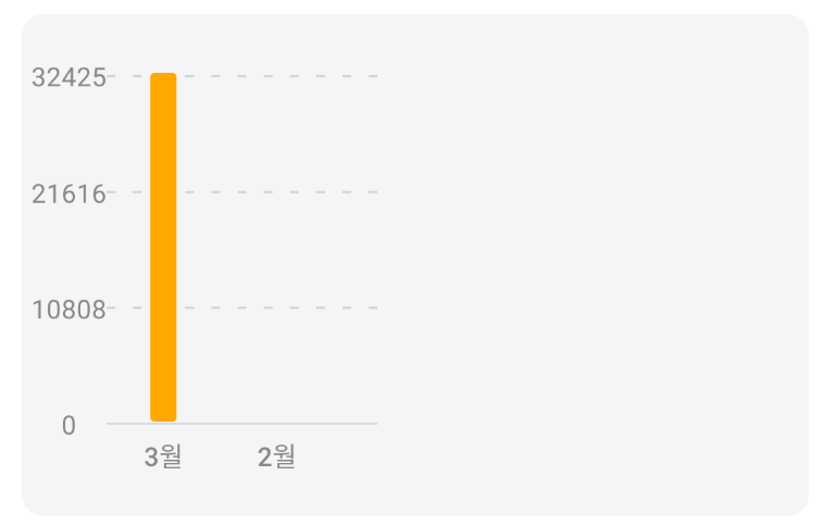
이렇게 되는 걸 방지하고
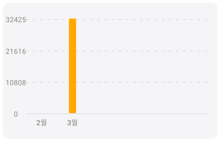
이렇게 되길 원해서 따로 설정해 주었습니다.
components/chart/DataList.tsx
// react, react-native
import React from 'react';

// utils
import {numberCommas} from '../../utils/calculate';

// style
import {DataList as Style} from '../../styles/chart.styles';

interface PropsType {
  selectedTab: string;
  selectYear: string;
  recordData: {value: number; label: string}[];
}

const DataList = ({selectedTab, selectYear, recordData}: PropsType) => {
  // [{"label": "2월", "value": 8}, {"label": "3월", "value": 324248}]
  // console.log('DataList페이지: ', recordData);

  return (
    <>
      {/* recordData에 데이터가 없으면 "데이터가 없습니다." 출력하기 */}
      {recordData.length ? (
        <Style.container>
          {recordData.reverse().map(data => (
            <Style.list key={data.label}>
              <Style.title>
                {selectedTab === 'month' ? `${selectYear}년` : ''}
                {data.label}
              </Style.title>
              <Style.text>영업 금액 : {numberCommas(data.value)}원</Style.text>
            </Style.list>
          ))}
        </Style.container>
      ) : (
        <Style.emptyView>
          <Style.emptyText>데이터가 없습니다.</Style.emptyText>
        </Style.emptyView>
      )}
    </>
  );
};

export default DataList;
데이터가 최근데이터가 위에 있고 과거데이터가 아래에 있길 원해서 reverse()를 사용해 주었습니다.
styles/chart.styles.ts
// react, react-native
import {ScrollView, Text, TouchableOpacity, View} from 'react-native';

// library
import styled from 'styled-components';

// style
import Theme from './Theme';

// Chart
export const Chart = {
  wrap: styled(View)`
    padding: 0 16px;
  `,
  line: styled(View)`
    margin-top: 20px;
    width: 100%;
    height: 1px;
    background: ${Theme.colors.grey};
  `,
};

// Tabs
interface TabsType {
  select: boolean;
}

export const Tabs = {
  container: styled(View)`
    ${Theme.common.flexRowCenter}
    gap: 8px;
    margin-top: 20px;
    margin-bottom: 8px;
  `,
  tabButton: styled(TouchableOpacity)<TabsType>`
    ${Theme.common.flexCenter}
    flex: 1;
    height: 40px;
    border-radius: 10px;
    background-color: ${props =>
      props.select ? Theme.colors.main : Theme.colors.lightGrey};
  `,
  tabText: styled(Text)<TabsType>`
    font-family: ${Theme.fonts.medium};
    color: ${props => (props.select ? '#fff' : Theme.colors.darkGrey)};
  `,
};

// BarChartView
interface CenterType {
  center?: boolean;
}
export const BarChartView = {
  wrap: styled(View)<CenterType>`
    height: 230px;
    background: ${Theme.colors.lightGrey};
    border-radius: 10px;

    /* props에 center가 있으면 flexCenter 주기 */
    ${props => props.center && Theme.common.flexCenter}
  `,
  emptyText: styled(Text)`
    ${Theme.fontCommon.base}
    color: ${Theme.colors.darkGrey};
  `,
  container: styled(View)`
    padding: 20px 0;
    margin: 0 16px 0 4px;
    overflow: hidden;
  `,
};

// DataList
export const DataList = {
  emptyView: styled(View)`
    ${Theme.common.flexCenter}
    flex: 1;
  `,
  emptyText: styled(Text)`
    ${Theme.fontCommon.base}
    color: ${Theme.colors.darkGrey};
  `,
  container: styled(ScrollView)`
    padding: 0 16px;
  `,
  list: styled(View)`
    padding: 16px 0;
    border-bottom-width: 1px;
    border-color: ${Theme.colors.grey};
  `,
  title: styled(Text)`
    ${Theme.fontCommon.base}
    font-family: ${Theme.fonts.medium};
    color: ${Theme.colors.mainDeep};
  `,
  text: styled(Text)`
    margin-top: 8px;
    ${Theme.fontCommon.base}
    color: ${Theme.colors.black};
  `,
};